More Than a Logo,
A Compass for Inclusion

What Our Colors Represent
❤️💛💙💚🤍🧡
At Navigating Needs,
each color in our logo was selected
with intention to honor the diverse strengths
and support needs of individuals with disabilities.
❤️ Red ❤️
Physical Disabilities
Symbolizes strength, resilience, and visibility for individuals with physical disabilities, including mobility challenges, chronic health conditions, and structural impairments.
💛 Yellow 💛
Cognitive & Intellectual Disabilities
Represents diverse ways of thinking, processing, and learning. This color is to represent intellectual disabilities, developmental delays, and unique learning differences.
💙 Blue 💙
Psychiatric & Mental Health Disabilities
Reflects emotional wellness and psychiatric conditions,
many of which are completely invisible yet deeply impactful.
💚 Green 💚
Sensory Disabilities & Neurodivergence
Highlights sensory processing differences and neurodivergent experiences,
including ADHD, autism, and sensory integration needs.
🤍 White 🤍
Invisible and Undiagnosed Disabilities
Honors those whose challenges aren’t immediately visible, such as chronic pain,
neurological disorders, or those still seeking a diagnosis.
A vital reminder that not all needs are seen, but all are valid.
🧡 Orange 🧡
Sensory Processing Disorder Awareness & Holistic Inclusion
Represents Sensory Processing Disorder (SPD) and the bold energy, creativity,
and visibility at the heart of our work. By using orange, we honor the sensory needs and strengths of our community and promote awareness, inclusion, and joyful exploration.
❤️💛💙💚🤍🧡
🖤
🖤 An Extra Layer of Honor 🖤
Look closely at the head of The Navigator.
His features carry two final, deeply meaningful colors that ground everything we do.
Grey
Honors those navigating unforeseen illnesses and sudden, life-changing diagnoses.
Black
Is a quiet, permanent tribute dedicated to the memory of those we have lost.
They remain a vital part of our community, and their legacy inspires our mission every day.
Symbols That Guide Us

The Red-Tailed Hawk
Represents clarity, strength, and guidance. Known for its sharp vision and protective nature, the hawk symbolizes advocacy, insight, and resilience. Qualities we strive to embody as we support individuals in navigating their unique paths.
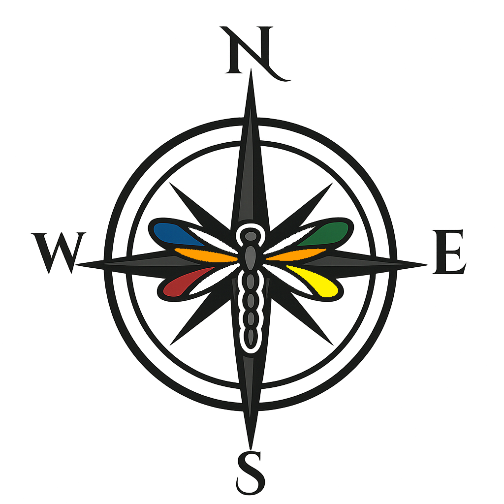
The Compass
Anchors our identity. It represents direction, exploration, and the freedom to chart a path that honors each person’s strengths. Just as no two journeys look the same, our compass reminds us to meet every learner where they are
and support them in finding their way forward.
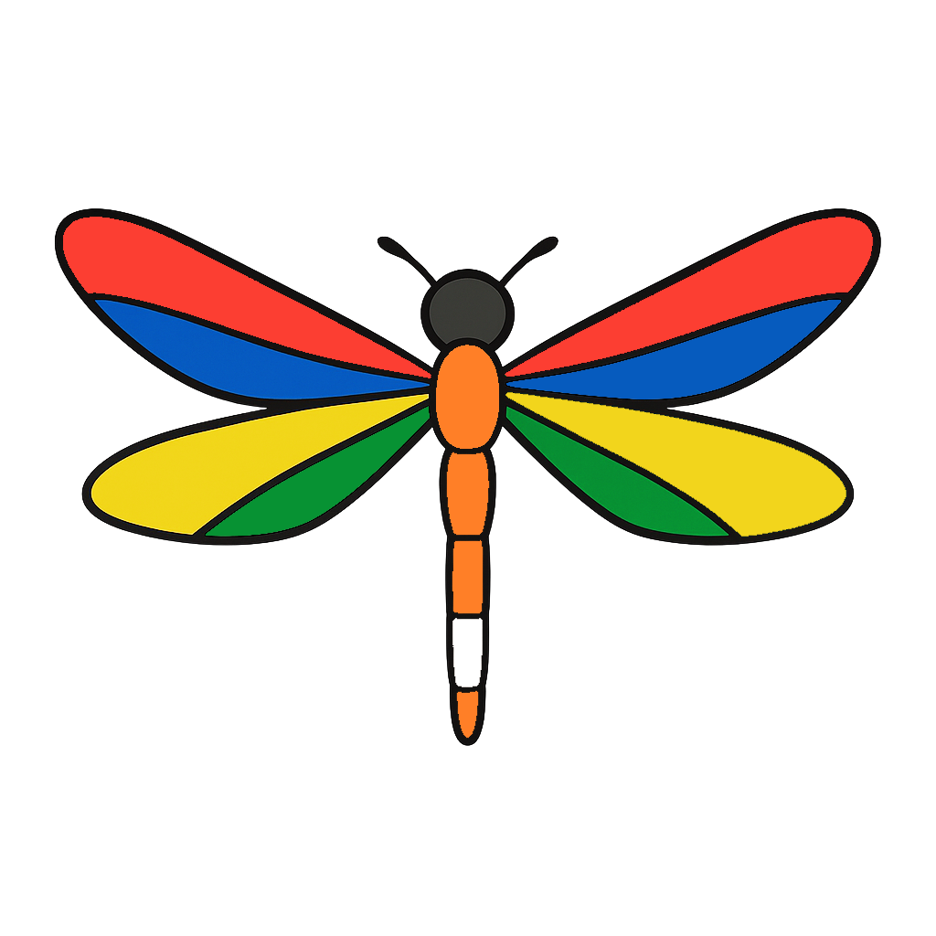
The Dragonfly
Symbolizes inclusion, transformation, and diversity. With its ability to move with grace and adaptability, the dragonfly reflects our belief in embracing growth, honoring individuality, and celebrating the many forms that progress can take.
Together, these symbols remind us to lead with a vision, but remain grounded in purpose.